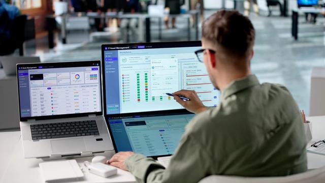
Why a simple number you trust beats a fancy dashboard
Dashboards look impressive, but if you don't trust the data behind them, they're decoration. A simple number you believe drives better decisions. Here's why substance beats polish.

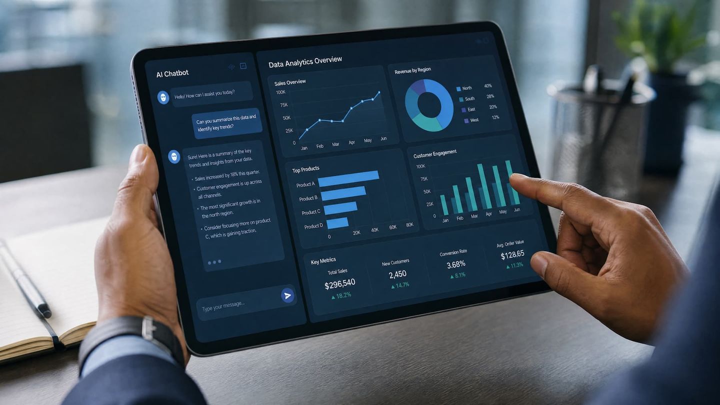
The short answer: a dashboard is only as good as the data behind it, and a beautiful chart built on patchy, scattered data is worse than a plain number you can trust — because it looks authoritative while being unreliable. Substance beats polish. Get the data trustworthy first, and keep the presentation simple.
The short version
- Dashboards impress but don't fix the data underneath them.
- A polished chart on bad data is confidently misleading.
- A simple, accurate, current number drives better decisions.
- Invest in trustworthy data first, presentation second.
The seduction of the dashboard
Dashboards feel like progress. They're colourful, real-time and comprehensive, and buying or building one feels like a decision made — "we're data-driven now." It's an easy thing to be sold, and an easy thing to want.
But if the numbers feeding it are scattered and disagree, the dashboard just presents the confusion more attractively. You haven't fixed anything; you've put a nicer frame around an unreliable picture. Polish can't fix a foundation problem, and dashboards are almost entirely polish.
Why trust is the whole game
The entire point of a number is that you act on it. If you don't trust it — because you know the data behind it is re-keyed across systems that don't agree — you won't act, no matter how nicely it's displayed. You'll second-guess it, cross-check it, or quietly ignore it and fall back on instinct.
A plain, believable number changes a decision. A beautiful, doubtful one gets ignored. So trust, not visualisation, is what actually makes data useful. This is worth sitting with, because most spending on "better data" goes into presentation when the real gap is trust.
A worked example: the dashboard that got switched off
A services business we can picture spent a good sum on a slick BI dashboard. Real-time gauges, colour-coded, the lot. Six weeks in, the operations manager had quietly gone back to her own spreadsheet. Why? The dashboard's revenue figure never matched what she saw in Xero, because it pulled from the sales tool, which double-counted part-paid invoices. She couldn't trust one number on it, so she trusted none of it.
The spreadsheet she went back to was ugly and manual and a day out of date — and she believed every cell, because she'd reconciled it herself. That's the whole lesson in one story. The expensive dashboard lost to the ugly spreadsheet on the only measure that counts: whether the person looking at it will act on what it says. Had the same money gone into fixing the double-counting at the source, the dashboard would have earned its keep. Instead it became an expensive screensaver in the boardroom.
Simple and current usually wins
Here's the thing most operational decisions don't need: real-time, drill-down analytics. What they need is a few accurate numbers, current enough to act on, presented plainly. A weekly figure you believe beats a live dashboard you second-guess every time you open it.
The effort is nearly always better spent making the numbers right than making the charts pretty. An accurate figure in a plain table does the job. A stunning visualisation of the wrong figure actively costs you, because it lends false confidence to a bad decision.
When fancy is actually worth it
None of this means richer analytics is never justified. There's a real place for it — once the foundation is solid and you have specific, repeated questions that need deeper cuts. A large operation modelling seasonal demand across many sites genuinely benefits from more sophisticated tooling.
But that's the second problem, not the first. Solve trust and accuracy before you solve visualisation. Build the single source of truth, then decide whether you need anything fancier on top. Most businesses find the plain numbers answer the questions they actually have.
How do I tell polish from substance when I'm being sold to?
When someone's pitching you a reporting product, one question cuts through the demo: where does this get its numbers, and what happens when two of my systems disagree? A tool that's all presentation will talk about charts, drill-downs and real-time gauges. A tool that fixes the real problem will talk about how it connects your sources and decides which one owns each fact.
If the answer is "it displays whatever you feed it," you're being sold polish. Fed scattered, conflicting data, it will produce scattered, conflicting charts — faster and more expensively than your spreadsheet. The substance is upstream, in the connecting and cleaning, which is unglamorous and rarely demos well. That's precisely why it gets skipped, and precisely why skipping it is the most common and costly mistake businesses make with their data.
Related reading
- One source of truth: the foundation of trustworthy reporting
- What business reporting should actually tell you
- From data to decisions: the complete guide
The honest first step
Better decisions start with numbers you can trust, which starts with getting your data into one accurate place. Mapping where your data lives — and where it disagrees — is what makes any number, simple or fancy, believable. That's the diagnosis, and it's where the value is found.
Tell us what you run, and we'll show you what's possible.